Crafting Perfect UI Kit in Flutter

Having a good UI kit is essential to building great apps. It's more than just aesthetics - it's the backbone of a seamless user experience and consistent branding. In this article, we will create a theme, buttons, and text fields similar to those in the popular shadcn-ui.
Outline
Theme
A theme represents the overall design and visual style of an application, encompassing various elements that contribute to the user interface. In Flutter, this is managed through ThemeData, which defines the color scheme, typography and appearance of widgets like Scaffold, AppBar, TextField, buttons, and more.
However, ThemeData is not just limited to its default properties; it can be extended using the ThemeExtension API. This powerful feature allows to create custom extensions, enhancing the Theme inherited widget with additional, app-specific styling options. In this guide, we’ll demonstrate how to create two such extensions— one for custom colors and another for typography.
Color Palette
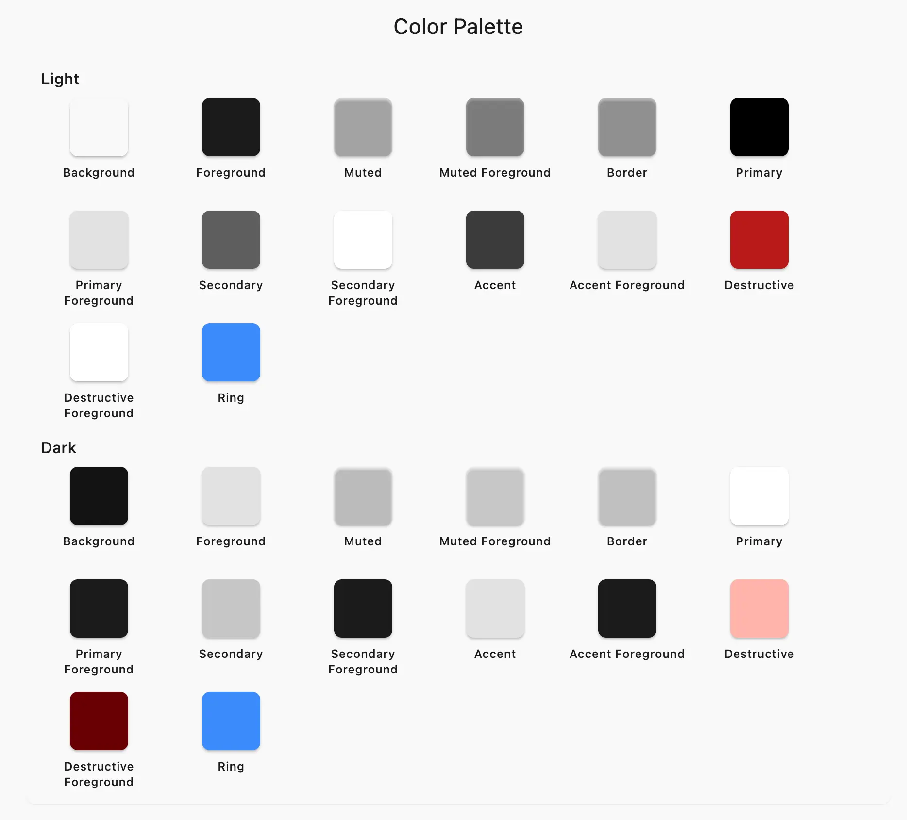
The color palette consists of all the colors used in the application. Usually these colors are named in an abstract way (like primary, secondary - not yellow or blue) so that it is possible to easily create different themes (e.g. light and dark).
Once you have an established color palette, you can create a class that combines all the palette colors in it. Let's add the key colors from Shadcn to it:
class ColorPalette extends ThemeExtension<ColorPalette> {
  const ColorPalette({
    required this.background,
    required this.foreground,
    required this.muted,
    required this.mutedForeground,
    required this.border,
    required this.primary,
    required this.primaryForeground,
    required this.secondary,
    required this.secondaryForeground,
    required this.accent,
    required this.accentForeground,
    required this.destructive,
    required this.destructiveForeground,
    required this.ring,
  });

  @override
  ThemeExtension<ColorPalette> copyWith();

  @override
  ThemeExtension<ColorPalette> lerp();
}
Color Palette contains all the colors used in the application.
The ColorPalette extension includes copyWith and lerp methods inherited from ThemeExtension. The lerp method enables smooth transitions between palettes when switching themes. Checkout the full code here.
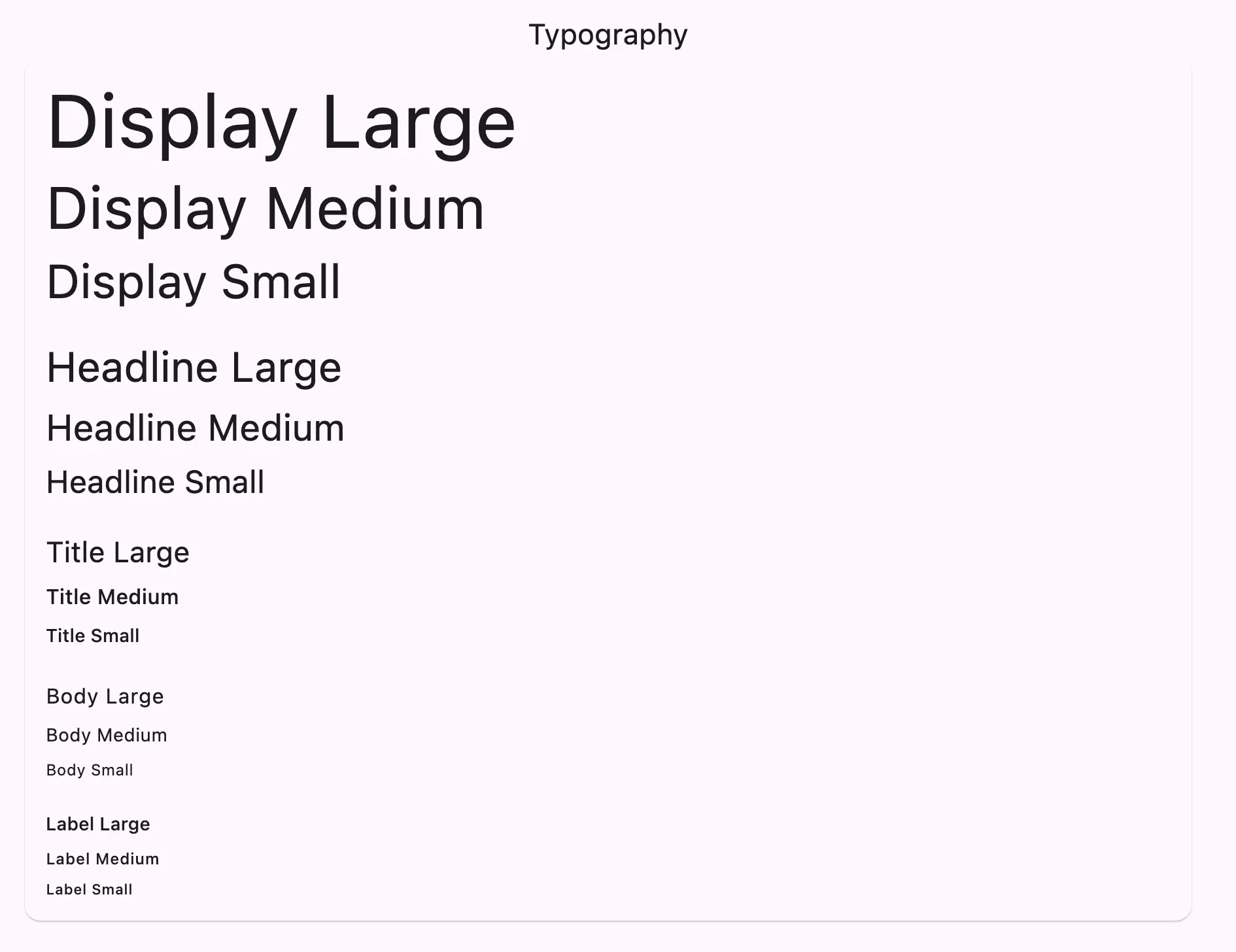
Typography
The same applies to typography. All text styles should be organized in one class. When combined with a cohesive color scheme, this approach ensures a consistent look for your app, eliminating the need to duplicate code. Here's how it looks like:
/// An extension for theme to provide typography.
class AppTypography extends ThemeExtension<AppTypography> {
  const AppTypography({
    required this.displayLarge,
    required this.displayMedium,
    required this.displaySmall,
    required this.headlineLarge,
    required this.headlineMedium,
    required this.headlineSmall,
    required this.titleLarge,
    required this.titleMedium,
    required this.titleSmall,
    required this.bodyLarge,
    required this.bodyMedium,
    required this.bodySmall,
    required this.labelLarge,
    required this.labelMedium,
    required this.labelSmall,
  });

  @override
  ThemeExtension<AppTypography> copyWith();

  @override
  ThemeExtension<AppTypography> lerp();
}
This uses the default Material 3 styles, but you can use whatever you want or what the designer gives you.
Combining extensions
Let’s unify the color palette and typography extensions into a single ThemeData. I’ve created a simple function to do this:
/// Creates a [ThemeData] object based on the provided [ColorPalette] and [AppTypography].
///
/// The [brightness] parameter is used to determine the brightness of the theme.
ThemeData createThemeData({
  required ColorPalette palette,
  required AppTypography typography,
  required Brightness brightness,
}) =>
    ThemeData(
      brightness: brightness,
      extensions: {
        palette,
        typography,
      },
    );
Now, we can use this method to create themes, like this:
final lightTheme = createThemeData(
  brightness: Brightness.light,
  palette: lightPalette,
  typography: appTypography,
);

final darkTheme = createThemeData(
  brightness: Brightness.dark,
  palette: darkPalette,
  typography: appTypography,
);
Depending on how you manage the current theme and user settings, you can pass the theme to the MaterialApp's theme and darkTheme properties. This way, every widget within the app will have access to these extensions. Here’s how it works in practice:
/// Create a helper extension
/// An extension for theme to get color palette and typography from [BuildContext].
extension ThemeDataExtensions on ThemeData {
  /// The color palette set for the app.
  ColorPalette get colorPalette => extension<ColorPalette>() ?? lightPalette;

  /// The typography set for the app.
  AppTypography get appTypography => extension<AppTypography>() ?? defaultTypography;
}

/// How to use these extensions
class SampleWidget extends StatelessWidget {
  const SampleWidget({super.key});

  @override
  Widget build(BuildContext context) => Scaffold(
        body: Center(
          child: UiText.bodyLarge(
            'Hello, World!',
            color: Theme.of(context).colorPalette.primary,
          ),
        ),
      );
}
Consider creating a helper extension, as shown in the snippet above, to retrieve the specified extension from ThemeData. If the context lacks this extension, it will return the default one. While optional, this can be useful for tests, saving you from including these extensions in every test.
Custom components
The main motivation for a UI kit is to have a collection of components that are used to build the UI. This provides the same benefits as the extensions we defined earlier - consistency of look, and ease of development.