Guide to forms in Flutter


Introduction
Applications frequently require data input from users, such as when creating an account. Forms serve as the primary tool for this purpose, making it crucial to understand the principles of effective form design and implementation.
Form Fundamentals
A form consists of multiple inputs designed to collect structured data from users. This data can then be processed and utilized within the application.
Forms typically necessitate input validation to ensure the data is valid before submission. This process involves retrieving values from inputs and verifying their adherence to specific rules. For instance, a password validator may check for the presence of special characters.
Moreover, forms can be complex, involving multiple pages, attachments, and dynamic fields. In such cases, it is crucial to address various concerns, including state preservation, delivering a positive user experience (UX), and effective error handling.
To begin, we will create a basic sign-up form featuring username and password fields, as follows:
Column(
  mainAxisSize: MainAxisSize.min,
  children: [
    const Text(
      'Sign Up',
      style: TextStyle(
        fontSize: 24,
        fontWeight: FontWeight.w600,
      ),
    ),
    Padding(
      padding: const EdgeInsets.only(top: 16),
      child: TextField(
        style: Theme.of(context).textTheme.bodyMedium,
        decoration: const InputDecoration(
          labelText: 'Username',
          border: OutlineInputBorder(),
        ),
      ),
    ),
    Padding(
      padding: const EdgeInsets.only(top: 16),
      child: TextField(
        style: Theme.of(context).textTheme.bodyMedium,
        decoration: const InputDecoration(
          labelText: 'Password',
          border: OutlineInputBorder(),
        ),
      ),
    ),
    Padding(
      padding: const EdgeInsets.only(top: 16),
      child: FilledButton.icon(
        onPressed: submitForm,
        icon: const Icon(Icons.send),
        label: const Text('Send'),
      ),
    ),
  ],
)
Currently, this is a simple screen with two text fields, lacking any validation.
Validation
To enhance the sign-up form with validation functionality, we will switch from using TextField widgets to TextFormField widgets. TextFormField widgets offer the advantage of built-in validation capabilities, working seamlessly within a Form widget. This setup allows for individual field validation as well as collective form validation.
For username and password fields we will implement the following validation rules:
- Username Validation:
- Rule 1: The username must be at least 6 characters long.
- Rule 2: The username must consist only of alphanumeric characters, which includes Latin letters and numbers.
- Password Validation:
- The password must be at least 8 characters long.
Here's an example implementation that incorporates these validation rules:
Form(
  child: Builder(builder: (context) {
    return Column(
      mainAxisSize: MainAxisSize.min,
      children: [
        const Text(
          'Sign Up',
          style: TextStyle(
            fontSize: 24,
            fontWeight: FontWeight.w600,
          ),
        ),
        Padding(
          padding: const EdgeInsets.only(top: 16),
          child: TextFormField(
            style: Theme.of(context).textTheme.bodyMedium,
            decoration: const InputDecoration(
              labelText: 'Username',
              border: OutlineInputBorder(),
            ),
            validator: (value) {
              value = value ?? '';
              if (value.length < 6) {
                return 'Username must be at least 6 characters long';
              }

              final regex = RegExp(r'^[a-zA-Z0-9]+$');

              if (!regex.hasMatch(value)) {
                return 'Username must only contain alphanumeric characters';
              }

              return null;
            },
          ),
        ),
        Padding(
          padding: const EdgeInsets.only(top: 16),
          child: TextFormField(
            style: Theme.of(context).textTheme.bodyMedium,
            decoration: const InputDecoration(
              labelText: 'Password',
              border: OutlineInputBorder(),
            ),
            validator: (value) {
              value = value ?? '';

              if (value.length < 8) {
                return 'Password must be at least 8 characters long';
              }

              return null ;
            },
          ),
        ),
        Padding(
          padding: const EdgeInsets.only(top: 8),
          child: Text(
            'Username should be at least 6 characters long and only contain alphanumeric characters. '
            'Password should be at least 8 characters long.',
            style: Theme.of(context).textTheme.bodySmall?.copyWith(
                  color: Theme.of(context).colorScheme.outline,
                ),
          ),
        ),
        Padding(
          padding: const EdgeInsets.only(top: 16),
          child: FilledButton.icon(
            onPressed: Form.of(context).validate,
            icon: const Icon(Icons.send),
            label: const Text('Send'),
          ),
        ),
      ],
    );
  }),
Each field now includes a validator that verifies the input's validity. For instance, the username validator employs a regular expression to ascertain whether the input consists solely of alphanumeric characters. Conversely, the password validator adopts a simpler approach by merely assessing the string's length.
To centralize the validation process, the column is wrapped with a Form widget. Furthermore, a Builder is utilized to create a context that has an access to the inherited widget, as created by the Form, which the "Send" button later leverages to validate the fields. See the implementation in action:
This method should adequately cover most situations. However, it's important to note that validators assigned to text form fields are restricted to synchronous operations. This limitation introduces the need for asynchronous validation to address scenarios where synchronous validators are insufficient.
Async Validation
Asynchronous validation is a process designed to verify inputs using a future-based API. This typically involves sending a request to a server or using some specific native functionalities, such as those available through Flutter's MethodChannel.
The built-in method for validation is quite effective, yet it lacks support for asynchronous operations. To address this gap, I have developed a sample implementation. This version retains most features of the original API but adds an option for asynchrony.
See a simple form built with it:
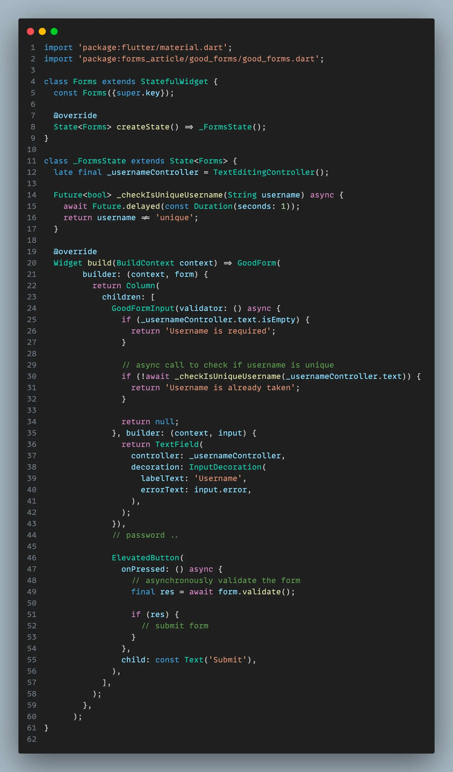
It provides two instances GoodForm (equivalent of a Form) and GoodFormInput (equivalent of FormField). In order to implement validation for a field, it is needed to wrap it with GoodFormInput and then trigger the validate method of GoodForm.
Let’s use this implementation to check if provided username is unique. Since it involves a backend request, I will create a dedicated module. This module will handle the validation: communicate with repository, yield appropriate states and handle errors.
For this purpose, I am utilizing the “control” package. This package is an enhanced version of Cubit, that implements Listenable and supports transformers, thereby offering a robust solution for our needs.
final class UsernameValidator extends StateController<UsernameValidatorState>
    with SeqControllerHandler {
  UsernameValidator({
    required ValidatorRepository repository,
    UsernameValidatorState? initialState,
  })  : _repository = repository,
        super(initialState: initialState ?? const _IdleUsernameValidatorState());

  final ValidatorRepository _repository;

  Future<UsernameValidatorState> validate(String username) async {
    await handle(
      () async {
        setState(const _ProcessingUsernameValidatorState());

        /* Synchronous validations first */
        final error = _validateSync(username);

        if (error != null) {
          return setState(_ErrorUsernameValidatorState(error));
        }

        final isUnique = await _repository.checkUnique(username);

        if (!isUnique) {
          return setState(
            const _ErrorUsernameValidatorState(UsernameIsAlreadyTakenException()),
          );
        }

        setState(const _IdleUsernameValidatorState(validated: true));
      },
    );

    return state;
  }

  // This function should return an [Exception] or [null]
  Object? _validateSync(String username) {
    if (username.isEmpty) {
      return const EmptyValueException();
    }

    if (username.length < 6) {
      return const ValueTooShortException();
    }
    if (username.length > 20) {
      return ValueTooLongException(max: 20, current: username.length);
    }
    if (!RegExp(r'^[a-zA-Z0-9]+$').hasMatch(username)) {
      return const ValueContainsInvalidCharactersException();
    }
    return null;
  }
}
The UsernameValidator class features a public method named validate, which executes validation on the provided value and returns a Future<void>. This design allows for asynchronous operation, enabling the caller to wait until the validation process completes.
It's important to note that the method _validateSync returns exceptions rather than returning strings. This approach adheres to the principle that localization should not be the responsibility of the controller. Localization is more efficiently managed at the widget layer, facilitating proper application-wide localization.
Furthermore, simplifying this module can be achieved by transferring the synchronous validation logic to the validator of a GoodFormInput. This adjustment would streamline the validation process.
The validator receives the controller's response and localizes any potential errors using _localizeUsernameError, as demonstrated below:
/* Localize an error returned by username validator to a human-readable text */
String? _localizeUsernameError(Object? error) => switch (error) {
      EmptyValueException _ => 'Username cannot be empty',
      UsernameIsAlreadyTakenException _ => 'Username is already taken',
      ValueTooShortException _ => 'Username is too short',
      ValueTooLongException _ => 'Username is too long',
      ValueContainsInvalidCharactersException _ => 'Username contains invalid characters',
      _ => null,
    };

/* Send Method */
void _send() async {
  print('Sending username: ${_usernameController.text}');
}

/* Screen */
GoodForm(builder: (context, form) {
  return Card(
    child: Padding(
      padding: const EdgeInsets.all(16),
      child: Column(
        mainAxisSize: MainAxisSize.min,
        children: [
          const Text(
            'Sign Up',
            style: TextStyle(
              fontSize: 24,
              fontWeight: FontWeight.w600,
            ),
          ),
          Padding(
            padding: const EdgeInsets.only(top: 16),
            child: GoodFormInput(
              validator: () async {
                final res = await _usernameValidator.validate(_usernameController.text);
                return _localizeUsernameError(res.isError);
              },
              builder: (context, field) {
                return TextField(
                  controller: _usernameController,
                  style: Theme.of(context).textTheme.bodyMedium,
                  decoration: InputDecoration(
                    labelText: 'Username',
                    border: const OutlineInputBorder(),
                    errorText: field.error,
                  ),
                );
              },
            ),
          ),
          Padding(
            padding: const EdgeInsets.only(top: 16),
            child: FilledButton.icon(
              onPressed: () async {
                final res = await form.validate();
                if (res) _send();
              },
              icon: const Icon(Icons.send),
              label: const Text('Send'),
            ),
          ),
        ],
      ),
    ),
  );
});
When a user clicks the 'send' button, GoodForm initiates validation for all GoodFormInputs. This triggers the usernameValidator to perform a network request, verifying the username's uniqueness alongside other synchronous checks. If an error is detected, the form.validate method returns false, preventing the form from being submitted.
Next, we'll focus on implementing the validator for the password field. This task doesn't necessitate any asynchronous operations. Instead, we'll develop a straightforward function to handle the validation process:
GoodFormInput(
  validator: () async {
    final password = _passwordController.text;

    if (password.isEmpty) {
      return 'Password cannot be empty';
    }

    if (password.length < 8) {
      return 'Password is too short';
    }
  },
  builder: (context, field) {
    return TextField(
      controller: _passwordController,
      style: Theme.of(context).textTheme.bodyMedium,
      decoration: InputDecoration(
        labelText: 'Password',
        border: const OutlineInputBorder(),
        errorText: field.error,
      ),
    );
  },
)
Dynamic form fields
Occasionally, it's necessary to dynamically display inputs based on previous user choices. For instance, in a billing form, users can select their preferred payment method. If they choose "credit card," fields for card number, expiration date, and CVV will appear. If they select "PayPal," only an email field will be shown.
To implement this dynamic input, we can use a listener that rebuilds and displays the input if a certain condition is met. This is relatively straightforward. However, another challenge arises - we need to ensure that only the visible inputs are validated.
Code for this screen looks as follows:
final _paymentMethod = ValueNotifier<PaymentMethod>(PaymentMethod.card);

@override
Widget build(BuildContext context) {
  return Scaffold(
    backgroundColor: Theme.of(context).colorScheme.background,
    body: Center(
      child: ConstrainedBox(
        constraints: BoxConstraints.loose(const Size.fromWidth(400)),
        child: GoodForm(builder: (context, form) {
          return ValueListenableBuilder(
            valueListenable: _paymentMethod,
            builder: (context, paymentMethod, _) {
              return Card(
                child: Padding(
                  padding: const EdgeInsets.all(16),
                  child: Column(
                    mainAxisSize: MainAxisSize.min,
                    children: [
                      const Text(
                        'Choose payment method',
                        style: TextStyle(
                          fontSize: 24,
                          fontWeight: FontWeight.w500,
                        ),
                      ),
                      const SizedBox(height: 16),
                      _PaymentMethodSelector(
                        paymentMethod,
                        (method) {
                          if (method != null) {
                            _paymentMethod.value = method;
                          }
                        },
                      ),
                      const SizedBox(height: 16),
                      Visibility(
                        visible: paymentMethod == PaymentMethod.card,
                        maintainState: true,
                        child: _CardDetails(
                          cardNumberController: _cardNumberController,
                          expiryDateController: _expiryDateController,
                          cvvController: _cvvController,
                          isVisible: paymentMethod == PaymentMethod.card,
                        ),
                      ),
                      Visibility(
                        visible: paymentMethod == PaymentMethod.paypal,
                        child: _PaypalDetails(
                          emailController: _paypalEmailController,
                          isVisible: paymentMethod == PaymentMethod.paypal,
                        ),
                      ),
                      const SizedBox(height: 16),
                      FilledButton.tonal(
                        onPressed: () async {
                          final res = await form.validate();
                          print(res);
                        },
                        child: const Text('Pay'),
                      ),
                    ],
                  ),
                ),
              );
            },
          );
        }),
      ),
    ),
  );
}
The code snippet provided outlines the creation of a selector widget for choosing the current payment method. Additionally, it uses two widgets, CardDetails and PaypalDetails, which specify the necessary fields for input. The "Pay" button employs form.validate to ensure the fields are correctly filled.
Below is the implementation of the CardDetails widget:
class _CardDetails extends StatelessWidget {
  const _CardDetails({
    required this.isVisible,
    required this.cardNumberController,
    required this.expiryDateController,
    required this.cvvController,
  });

  final bool isVisible;
  final TextEditingController cardNumberController;
  final TextEditingController expiryDateController;
  final TextEditingController cvvController;

  String? _validateCardNumber() {
    if (cardNumberController.text.isEmpty) {
      return 'Card number is required';
    }

		// credit card use Luhn's algorithm for validating credit card's name

    return null;
  }

  @override
  Widget build(BuildContext context) {
    return Column(
      mainAxisSize: MainAxisSize.min,
      children: [
        // Card number
        Padding(
          padding: const EdgeInsets.only(top: 16),
          child: GoodFormInput(
            validate: isVisible,
            validator: _validateCardNumber,
            builder: (context, field) {
              return TextField(
                style: Theme.of(context).textTheme.bodyMedium,
                keyboardType: TextInputType.number,
                decoration: InputDecoration(
                  labelText: 'Card number',
                  errorText: field.error,
                  border: const OutlineInputBorder(),
                ),
              );
            },
          ),
        ),

        // Expiry date and CVV
        // ...
        ),
      ],
    );
  }
}
The CardDetails widget utilizes controllers for the card number, expiry date, and CVV text fields, which are instantiated in the parent widget. This allows the parent to access the input values when needed for data submission.
Similar to previous examples, GoodFormInput is employed to incorporate a validator into a text field. Its current functionality merely verifies whether the input value is non-empty.
An essential aspect to note regarding GoodFormInput is the validate parameter. I employed the Visibility widget with the maintainState parameter set to true, indicating that even when the element is not visible on the screen, its state is preserved and included in the element tree. This means the element remains active. Specifically, this implies that form.validate will initiate its validation process even if the field is not visible, which is undesirable. Therefore, if the field is inactive, we simply pass false to this parameter, preventing unwanted validation triggers.
Here's how this implementation functions in practice:
Multi-page form
Previously, our focus was on single-page forms. However, for forms that are extensive and divided into several logical sections, transitioning to a multi-page format becomes necessary. To manage this effectively, state management should be elevated higher in the widget tree, allowing all sections of the form to utilize a centralized implementation.
This is typically achieved through the use of Scopes—constructs that are visible only within a specific subtree. Scopes are often created using InheritedWidget, StatefulWidget, or a combination of both.
For multi-page forms, it's crucial to manage navigation, deep-linking, and validation meticulously. This ensures users cannot proceed to subsequent sections without completing the preceding ones. Additionally, it's common practice to store the data from these extensive forms in the cloud. Scopes play a significant role in facilitating these processes.
Let's design a simple scope for use in a job application form, illustrating how these concepts can be applied practically:
class ApplicationForm extends StatefulWidget {
  const ApplicationForm({
    required this.child,
    super.key,
  });

  final Widget child;

	/// Obtain [ApplicationFormState] from BuildContext
  static ApplicationFormState of(BuildContext context, {bool listen = true}) {
    final result = listen
        ? context.dependOnInheritedWidgetOfExactType<_ApplicationFormInherited>()
        : context.findAncestorWidgetOfExactType<_ApplicationFormInherited>();
    if (result == null) {
      throw FlutterError(
        'ApplicationForm.of() called with a context that does not contain an ApplicationForm.',
      );
    }
    return result.state;
  }

  @override
  State<ApplicationForm> createState() => ApplicationFormState();
}

class ApplicationFormState extends State<ApplicationForm> {
  var _firstModel = const FirstModel(fullName: '', description: '');
  var _secondModel = const SecondModel(workExperience: '');

	/// Like copyWith, updates model for the first part of a form
  void updateFirstModel({
    String? fullName,
    String? description,
  }) {
    setState(() {
      _firstModel = _firstModel.copyWith(
        fullName: fullName,
        description: description,
      );
    });
  }

	/// Like copyWith, updates model for the second part of a form
  void updateSecondModel({
    String? workExperience,
  }) {
    setState(() {
      _secondModel = _secondModel.copyWith(
        workExperience: workExperience,
      );
    });
  }

	/// Current step of a form
	int get step {
    if (_secondModel.workExperience.isNotEmpty) {
      return 2;
    }

    return 1;
  }

  @override
  Widget build(BuildContext context) {
    return widget.child;
  }
}

/// Inherited widget created by [ApplicationForm] internally
/// to provide its state down the tree.
class _ApplicationFormInherited extends InheritedWidget {
  const _ApplicationFormInherited({
    required this.state,
    required super.child,
  });

  final ApplicationFormState state;

  @override
  bool updateShouldNotify(_ApplicationFormInherited oldWidget) {
    return oldWidget.state._firstModel != state._firstModel ||
        oldWidget.state._secondModel != state._secondModel;
  }
}
The ApplicationForm is a StatefulWidget that features two primary methods: updateFirstModel and updateSecondModel. These methods function similarly to the copyWith method, modifying local models stored within the widget's state.
ApplicationForm provides ApplicationFormInherited internally, ensuring it is accessible throughout the widget subtree. It also utilizes ApplicationFormInherited to fetch state information using the of method.
Here is the initial section of a form that uses the ApplicationForm scope:
class _FirstScreenState extends State<FirstScreen> {
  late final TextEditingController _fullNameController;
  late final TextEditingController _descriptionController;

  @override
  void initState() {
    super.initState();

    final form = ApplicationForm.of(context, listen: false);
    _fullNameController = TextEditingController()
      ..addListener(() {
        form.updateFirstModel(
          fullName: _fullNameController.text,
        );
      });
    _descriptionController = TextEditingController()
      ..addListener(() {
        form.updateFirstModel(
          description: _descriptionController.text,
        );
      });
  }

  @override
  Widget build(BuildContext context) => Scaffold(
        body: Padding(
          padding: const EdgeInsets.all(8.0),
          child: GoodForm(
            builder: (context, form) {
              return Column(
                children: [
                  GoodFormInput(
                      validator: () {
                        if (_fullNameController.text.isEmpty) {
                          return 'Full Name is required';
                        }
                        return null;
                      },
                      builder: (context, input) {
                        return TextField(
                          controller: _fullNameController,
                          decoration: InputDecoration(
                            labelText: 'Full Name',
                            errorText: input.error,
                          ),
                        );
                      }),
                  GoodFormInput(
                      validator: () {
                        if (_descriptionController.text.isEmpty) {
                          return 'Description is required';
                        }
                        return null;
                      },
                      builder: (context, input) {
                        return TextField(
                          controller: _descriptionController,
                          decoration: InputDecoration(
                            labelText: 'Description',
                            errorText: input.error,
                          ),
                        );
                      }),
                  Padding(
                    padding: const EdgeInsets.only(top: 8),
                    child: ElevatedButton(
                      onPressed: () async {
                        final res = await form.validate();

                        if (res && mounted) {
                          _navigateToSecondScreen(context);
                        }
                      },
                      child: const Text('Go to second screen'),
                    ),
                  ),
                ],
              );
            }
          ),
        ),
      );
}
This screen employs GoodFormInput for validation and utilizes the ApplicationForm scope to store input values for the full name and description fields. When the ElevatedButton is pressed, and GoodForm.validate returns true, it triggers navigation to the second screen of the form.
ApplicationForm should be positioned higher in the widget tree, ideally encapsulating the navigator that includes both the first and second screens of the form. The recommended structure is as follows:
- Root Navigator (provided by the Material app)
- Home Screen
- Another Screen
- Application Form Navigator (a separate Navigator widget, wrapped in
ApplicationForm)- Form Screen 1
- Form Screen 2
This arrangement ensures that the ApplicationForm is accessible from any screen within the application form navigator. Depending on a case, it can also be a good idea to provide ApplicationForm at the root.
For this project, the ApplicationForm will be implemented at the root of the widget tree as demonstrated below:
class MainApp extends StatelessWidget {
  const MainApp({super.key});

  @override
  Widget build(BuildContext context) {
    return MaterialApp(
      home: const FirstScreen(),
      theme: ThemeData(
        colorSchemeSeed: Colors.deepPurple,
      ),
      builder: (context, child) {
        return ApplicationForm(
          child: GoodForm(builder: (context, form) {
            return child!;
          }),
        );
      },
    );
  }
}
The approach for the second screen is analogous. Once again, we have a validated field whose data is saved within the ApplicationForm using GoodForm for validation:
class _SecondScreenState extends State<SecondScreen> {
  late final TextEditingController _workExperienceController;

  @override
  void initState() {
    super.initState();
    final form = ApplicationForm.of(context, listen: false);
    _workExperienceController = TextEditingController()
      ..addListener(() {
        form.updateSecondModel(
          workExperience: _workExperienceController.text,
        );
      });
  }

  @override
  void dispose() {
    _workExperienceController.dispose();
    super.dispose();
  }

  @override
  Widget build(BuildContext context) => Scaffold(
        body: Padding(
          padding: const EdgeInsets.all(8.0),
          child: GoodForm(
            builder: (context, form) {
              return Column(
                children: [
                  GoodFormInput(
                      validator: () {
                        if (_workExperienceController.text.isEmpty) {
                          return 'Work Experience is required';
                        }
                        return null;
                      },
                      builder: (context, input) {
                        return TextField(
                          controller: _workExperienceController,
                          decoration: InputDecoration(
                            labelText: 'Work Experience',
                            errorText: input.error,
                          ),
                        );
                      }),
                  Padding(
                    padding: const EdgeInsets.only(top: 8),
                    child: ElevatedButton(
                      onPressed: () async {
                        final appForm = ApplicationForm.of(context, listen: false);

                        final res = await form.validate();

                        // Submit the form
                        if (res) {
                          print(appForm._firstModel);
                          print(appForm._secondModel);
                        }
                      },
                      child: const Text('Submit'),
                    ),
                  ),
                ],
              );
            }
          ),
        ),
      );
}
Once all fields are successfully validated, the data can be submitted to the backend. See how this all looks together:
State Restoration
When a user switches between mobile applications, the initially active app is relegated to the background, or "shadowed." Both iOS and Android operating systems might terminate these background apps to allocate more memory and enhance the performance of the currently active app.
However, this process can disrupt user experience. If a user returns to a previously used app, the operating system reactivates it. Without a configured mechanism for preserving the app's state, it will restart from the beginning, losing any unsaved progress. This lack of continuity can be frustrating for users, akin to losing all data entered in a lengthy form due to an unexpected phone call before submission.
Flutter includes a built-in state restoration mechanism. This allows an application to restore its state even if the operating system destroys it. There are four key components:
- RestorationManager: Facilitates communication with native platforms, leveraging Android and iOS APIs to preserve state properties that can be restored.
- RestorationBucket: Acts as a repository for segments of restoration data, essential for an application to reclaim its previous state.
- RestorationScope: A widget that provides access to a RestorationBucket. Additionally, a RootRestorationScope is available to activate state restoration across the entire application.
- RestorationMixin: A mixin designed for the straightforward restoration of stateful properties, simplifying the process of state recovery.
Flutter widgets commonly support a restorationId parameter, enabling state preservation. For example, assigning a restorationId to a TextField ensures that both its text content (if no specific controller is supplied) and scroll position are maintained upon app restoration.
To activate state restoration, begin by providing a restorationId to the MaterialApp, CupertinoApp, or WidgetsApp. A non-null restorationId triggers the insertion of a RootRestorationScope at the app's root and enables state restoration.
This functionality proves invaluable for maintaining the scroll positions within lists. Also, the Navigator widget serves as a key example: if an app is sent to the background and subsequently restarted, the navigation stack resets, reverting to the initial screen. Without a restorable Navigator, other restoration processes become moot, as pages lacking a restorationId are lost, alongside their data.
To effectively restore fields, there is a RestorationMixin alongside RestorableProperties, where a RestorableProperty outlines methods for serializing and deserializing value. The RestorationMixin utilizes these properties to store values in a dedicated bucket.
Below is a guide on implementing restoration for an integer counter:
class _RestorableCounterState extends State<RestorableCounter>
    with RestorationMixin {
  // The current value of the counter is stored in a [RestorableProperty].
  // During state restoration it is automatically restored to its old value.
  // If no restoration data is available to restore the counter from, it is
  // initialized to the specified default value of zero.
  final RestorableInt _counter = RestorableInt(0);

  // In this example, the restoration ID for the mixin is passed in through
  // the [StatefulWidget]'s constructor.
  @override
  String? get restorationId => widget.restorationId;

  @override
  void restoreState(RestorationBucket? oldBucket, bool initialRestore) {
    // All restorable properties must be registered with the mixin. After
    // registration, the counter either has its old value restored or is
    // initialized to its default value.
    registerForRestoration(_counter, 'count');
  }

  @override
  void dispose() {
    _counter.dispose();
    super.dispose();
  }
}
This widget features a RestorableInt field named counter, and utilizes a restorationId to identify the appropriate bucket for storing its properties. Additionally, it implements a restoreState method. This method leverages the registerForRestoration method, provided by the RestorationMixin, to restore the widget's state.
With that in mind, let's proceed to implement state restoration for our multi-page form example:
class MainApp extends StatelessWidget {
  const MainApp({super.key});

  @override
  Widget build(BuildContext context) {
    return MaterialApp(
      restorationScopeId: 'app',
      home: const FirstScreen(),
      theme: ThemeData(
        colorSchemeSeed: Colors.deepPurple,
      ),
      builder: (context, child) {
        return ApplicationForm(
          child: GoodForm(builder: (context, form) {
            return child!;
          }),
        );
      },
    );
  }
}
I added restorationScopeId into the MaterialApp to activate state restoration across the entire application. It's important to note that if there's a need to establish a scope at the root level, this should be done within the builder. This approach ensures that the context derived from the builder is equipped with a restoration scope and any additional scopes initiated by the MaterialApp or WidgetsApp.
Moving forward, our next step involves enabling state restoration for the Navigator. Since our current navigation strategy utilizes an imperative push/pop approach, we must shift towards a navigation model that facilitates state restoration:
static Route _secondScreenBuilder(BuildContext context, Object? arguments) {
  return MaterialPageRoute(builder: (context) {
    return const SecondScreen();
  });
}

void _navigateToSecondScreen(BuildContext context) {
  Navigator.of(context).restorablePush(_secondScreenBuilder);
}
To facilitate state restoration for navigator pages with the imperative API, it's essential to utilize restorablePush. This technique ensures the navigation stack is reinstated.
Observe how the first screen's implementation is refined:
class _FirstScreenState extends State<FirstScreen> with RestorationMixin {
  late final RestorableTextEditingController _fullNameController;
  late final RestorableTextEditingController _descriptionController;

  @override
  void initState() {
    super.initState();

    final form = ApplicationForm.of(context, listen: false);
    _fullNameController = RestorableTextEditingController()
      ..addListener(() {
        form.updateFirstModel(
          fullName: _fullNameController.value.text,
        );
      });
    _descriptionController = RestorableTextEditingController()
      ..addListener(() {
        form.updateFirstModel(
          description: _descriptionController.value.text,
        );
      });
  }

  @override
  void dispose() {
    _fullNameController.dispose();
    _descriptionController.dispose();
    super.dispose();
  }

  @override
  void restoreState(RestorationBucket? oldBucket, bool initialRestore) {
    registerForRestoration(_fullNameController, 'full_name');
    registerForRestoration(_descriptionController, 'description');
  }

  @override
  String? get restorationId => 'first_screen';

  @override
  Widget build(BuildContext context) => Scaffold(
        body: Padding(
          padding: const EdgeInsets.all(8.0),
          child: Column(
            children: [
              GoodFormInput(
                  restorationId: 'full_name_input',
                  validate: ApplicationForm.of(context).step == 1,
                  validator: () {
                    if (_fullNameController.value.text.isEmpty) {
                      return 'Full Name is required';
                    }
                    return null;
                  },
                  builder: (context, input) {
                    return TextField(
                      restorationId: 'full_name',
                      controller: _fullNameController.value,
                      decoration: InputDecoration(
                        labelText: 'Full Name',
                        errorText: input.error,
                      ),
                    );
                  }),
              GoodFormInput(
                  restorationId: 'description_input',
                  validate: ApplicationForm.of(context).step == 1,
                  validator: () {
                    if (_descriptionController.value.text.isEmpty) {
                      return 'Description is required';
                    }
                    return null;
                  },
                  builder: (context, input) {
                    return TextField(
                      restorationId: 'description',
                      controller: _descriptionController.value,
                      decoration: InputDecoration(
                        labelText: 'Description',
                        errorText: input.error,
                      ),
                    );
                  }),
            ],
          ),
        ),
      );
}
Each input field is assigned a restorationId, enabling state recovery during the restoration process. Furthermore, this widget incorporates two controllers which also require restoration. This is effectively accomplished through the use of the RestorationMixin and restorable properties.
See how this works now:
Ending
Thank you for reading! To ensure you don't miss out on my upcoming articles, I invite you to subscribe to my Telegram channel, follow me on LinkedIn, and Twitter for the latest updates. Here are the links for easy access:
Stay tuned for more insights and tips!