UI Components, Adaptive and Responsive Design
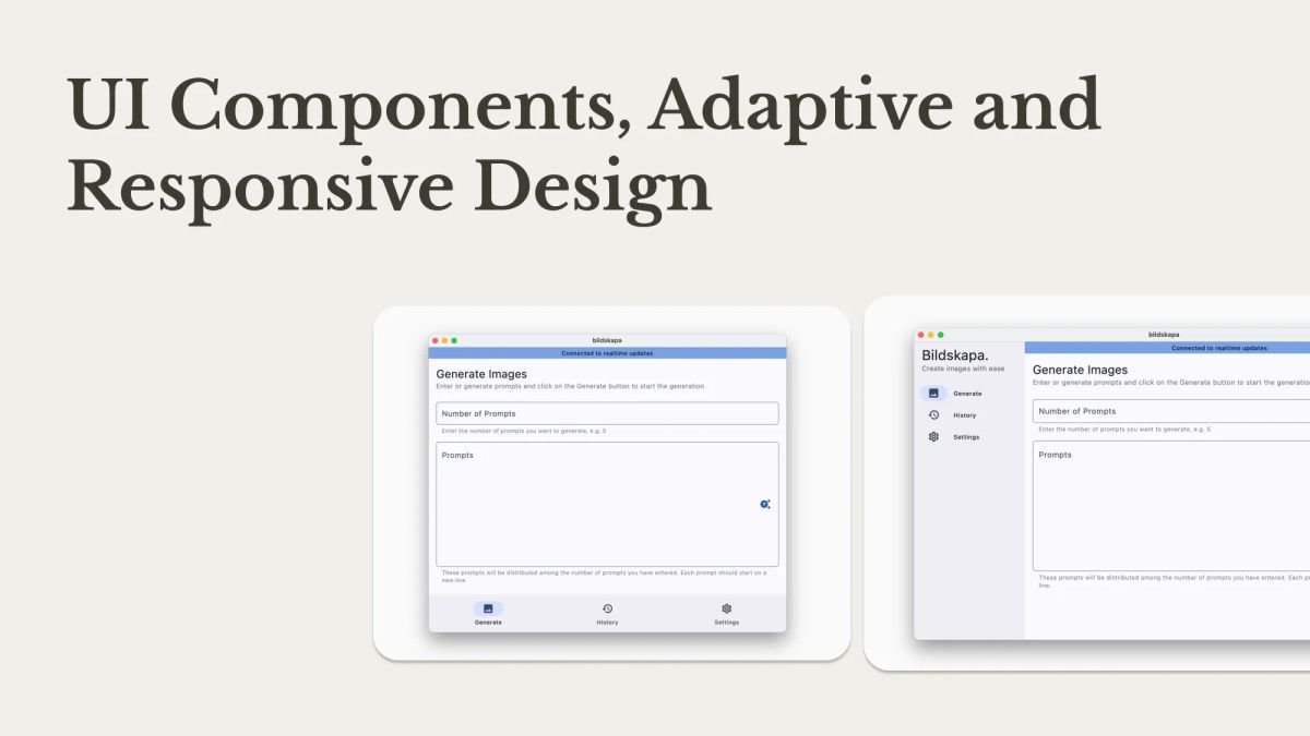
This is the continuation of a series of articles Crafting Perfect UI Kit, where we talk about implementing a UI kit for the Flutter application. So far we've talked about theme (colors, typography) and created a few components - text field and buttons.
In this part, we will create more components such as text, cards and other button types. In addition, we will talk about adaptive and responsive design, and how to implement them correctly.

